Wargame Design Studio have donated two copies of their latest WW2 release to the Corner. The games will go to readers willing to pore over maps of the Carpathian Basin.
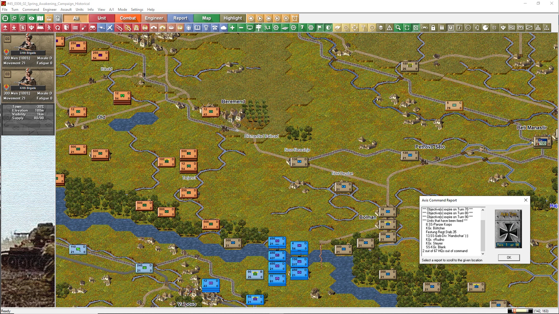
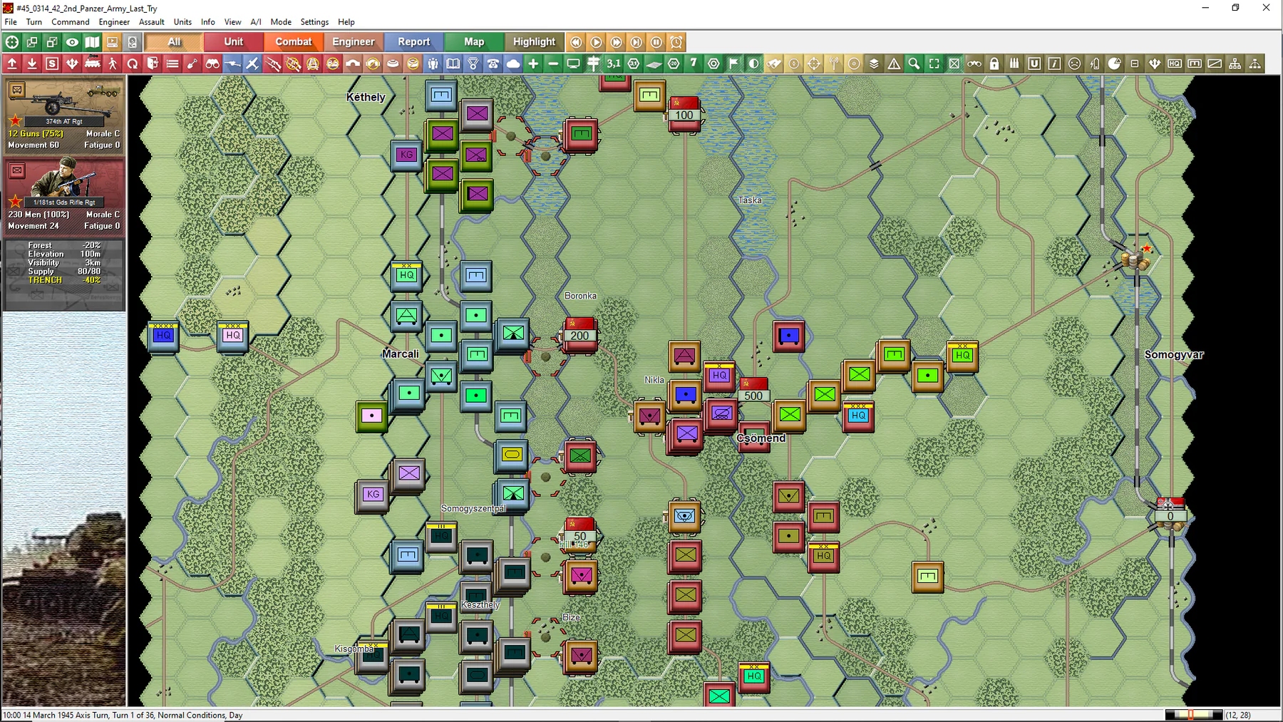
With their 1km gauge chicken-wire, two-hour turns, and company- and battalion-sized units, the thirty Panzer Campaigns titles can’t rival the intimacy of WDS’s Panzer Battles or Squad Battles games, however, individually tracked infantry and vehicle kills, and a healthy provision of relatively small, brief scenarios, means gamers raised on the likes of Combat Mission and Panzer Corps shouldn’t feel distant from the action or overwhelmed by the workload.
Having sampled Spring Awakening’s 85-strong scenario selection while preparing the competition, I can promise the two winners colourful OOBs and interesting venues. Although Unternehmen Frühlingserwachen was the last significant German offensive of the war, it involved weaponry and transport verging on the obsolete. Bicycle- and horse-reliant units regularly catch the eye, as do Italian AFVs sent east after the 1943 armistice. A number of the scraps start with Axis forces traversing major rivers or clearing corridors in minefields.
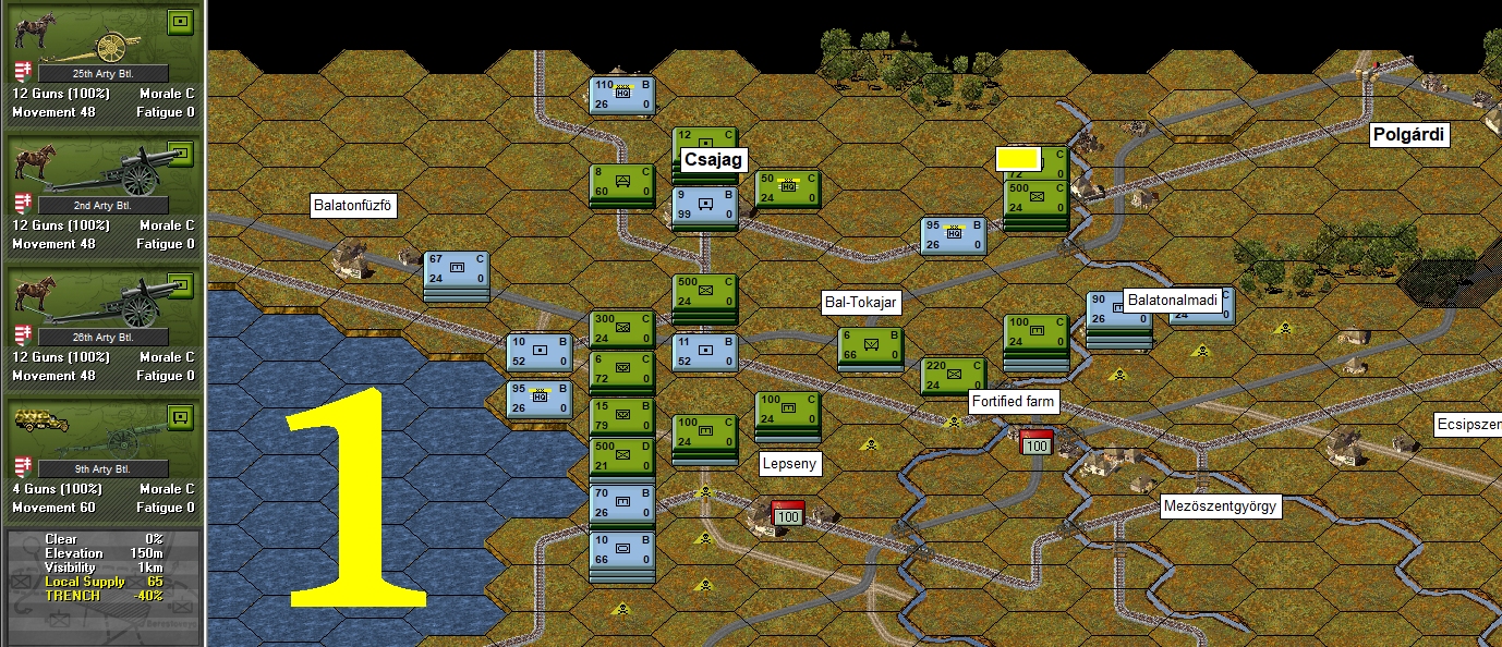
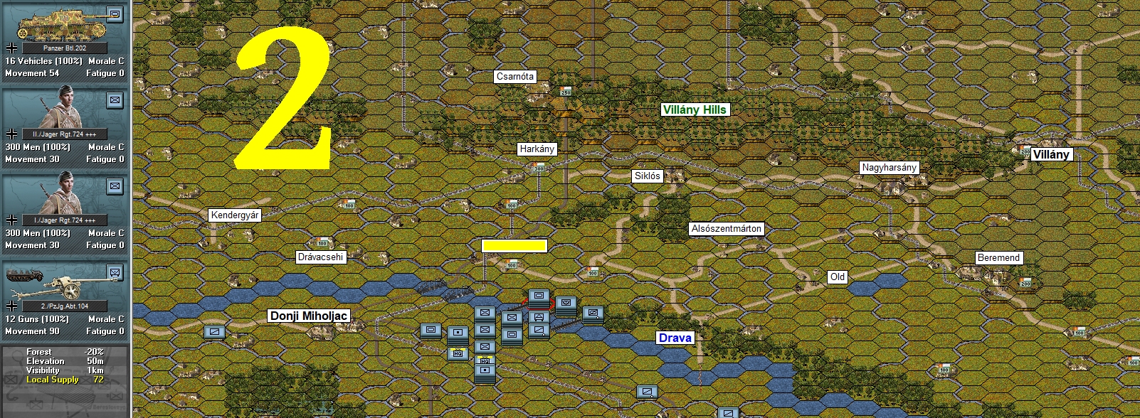
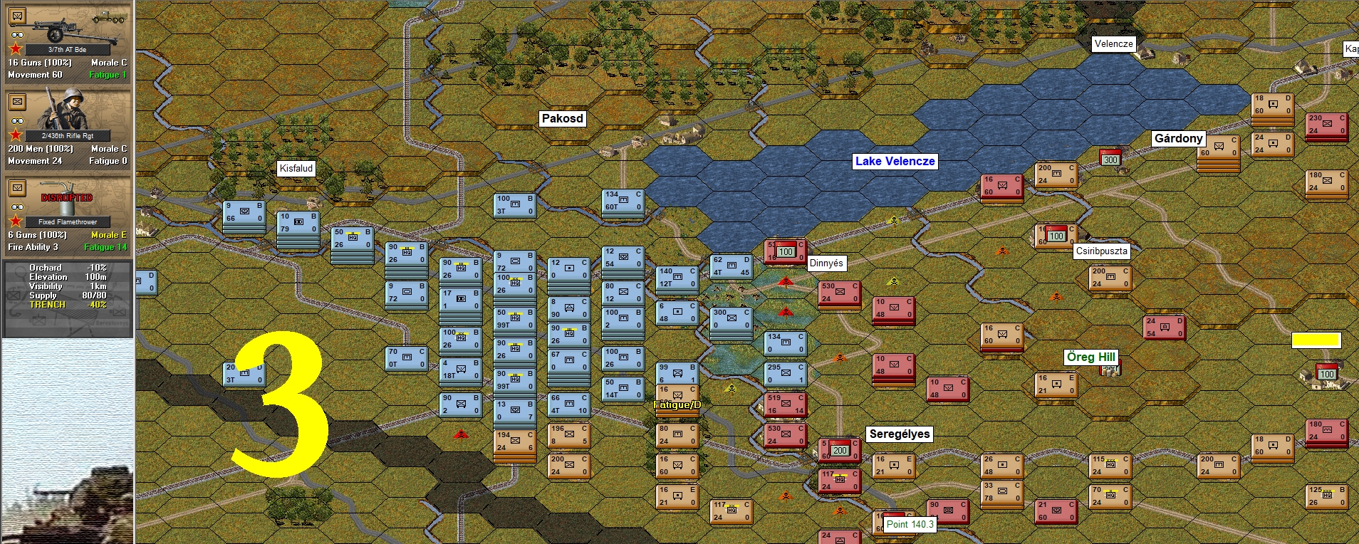
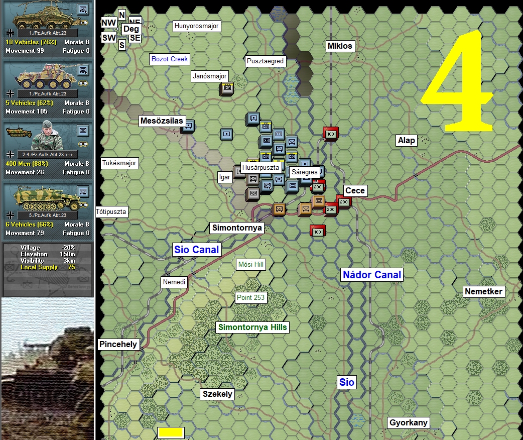
Like the sound of fighting rigorously researched IGOUGO battles using mounted Don Cossacks, horse-drawn artillery, and crap armoured hand-me-downs? I’ve obscured (with yellow rectangles) four place names in the following four screenshots. Send me (tim at tallyhocorner dot com) the names of those four places by 0800 UTC, August 17, and your name will go into the hat for Sunday’s draw.
– – Clues – –
- Name #1 begins with a F.
- Name #2 ends with an S.
- Name #3 is eleven letters long.
- Name #4 begins with an M.
Only one entry per person, please. Best of luck.

I’m not going to enter, because I don’t want to win. At risk of upsetting the people who know what they’re doing..
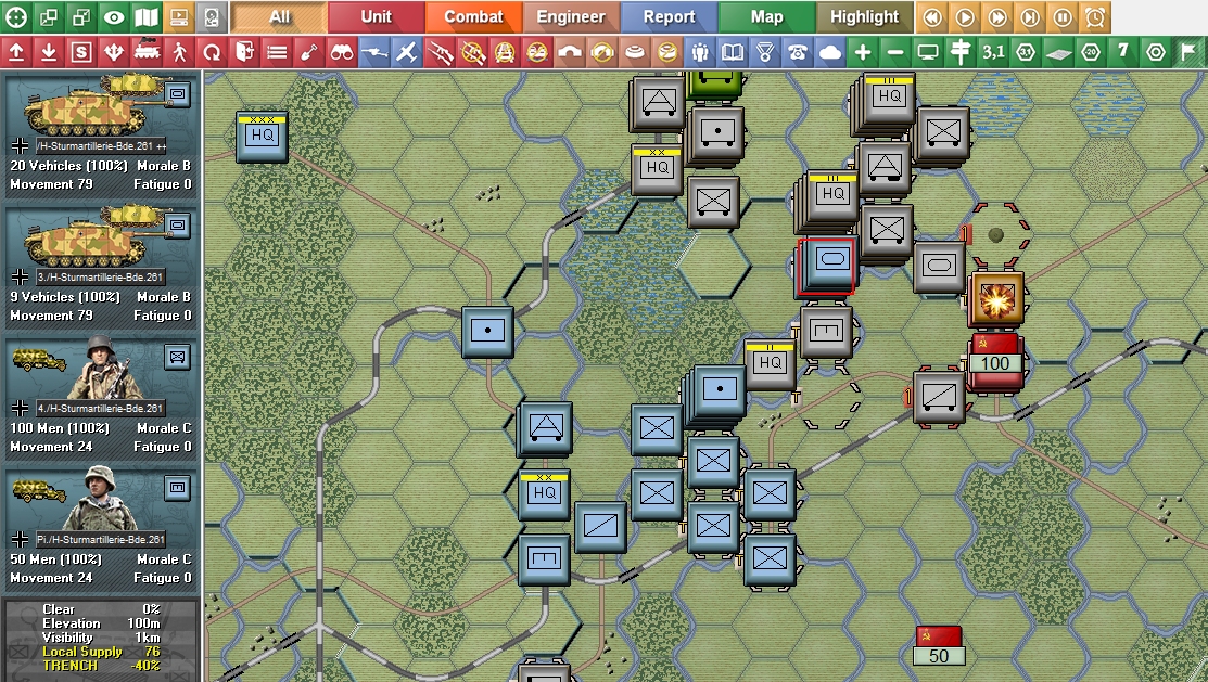
I don’t get the unit markers. A blue rectangle with numbers. Sure, I don’t doubt that’s meaningful within the game, and supports the game mechanics.
But within that, a tiny symbol. A rectangle with a cross in it. Or a badly orphographed ‘m’.
Is that arcane iconography intended to impart meaning? Is this game really expecting me to learn an obtuse language before I play? Are decades of computer graphics to be discarded in favour of some archaic language nobody knows?
I’m sorry but no. The game clearly has no intention of being approachable, and its opaque and obscure idolatry – along with so many in its genre – tells me that it doesn’t want me to engage with and enjoy the game.
So I won’t.
I have a goal of making wargames more accessible.
I love the history, and the way that actual long-term strategy of maneuvering forces and reinforcements to battles, and planning for night turns, and the impact of sudden changes in the weather, and the fog of war that shifts over time.
But yes, nato unit iconography, and a minute set of stats with no tooltips, hexagon grids, and low resolution art don’t encourage new players to invest.
My hope is that I can create something that brings those core positives but discards the trappings of 1970s boardgames. Fingers crossed I can pull it off one day.
Well, write the game you want to write, play or want others to play.
The number of games that do adopt and use NATO symbols suggests that these are commonly recognised and accepted, and that there’s an audience for such games.
It’s great that people are writing games for this audience, and my apologies if I inferred otherwise. I’m just not that audience.
In Panzer Campaigns titles it’s possible to display unit icons rather than NATO symbols. They aren’t that legible at some of the game’s (set) zoom levels, but I think they work pretty well at max zoom:
https://tallyhocorner.com/wp-content/uploads/2024/08/springawakening11.jpg
Dude, this is not some product of insane imagination. Those are standard NATO symbols. For most wargamers they are quite easy and natural to use, since they are a universal way to designate unit role and composition in most modern scenarios. Most of the people who play wargames sooner or later learn to read them with the same ease, as blue = water, green = forest etc.
However, if I recall correctly, most of the WDS titles that received a modernisation allow you to switch to one or two ways of graphical representation of units on the map. They are not as readable imo, and serve as more of a crutch for people who are yet to learn NATO symbols, but they are there.
Don’t get me wrong, I understand how it is difficult to read these symbols if you have never been exposed to it, but being angry at them is very akin to being angry at how pawns in chess have no facial features. Especially, since there IS a graphical option.
The most common (and the ones you are going to use the most) are quite easy to learn. For everything else there are good tooltips. I confess, I do sometimes look up, what the hell the new unit in my rear is.
Xs are infantry, oblongs – are armor, crossed oblongs – mech infantry, fat dots – artillery, diagonal line – cavalry. This is more or less all you have to know. And bear in mind, that 95% of wargames that are less gamey will use these symbols, just because at this point it is as normal as pressing space to jump.
And if you want to connect with your unit on a more personal level – there are always art pieces on the unit tab for each unit you have or is going to face.
I take it you’ve never played a war game.
I am not going to participate because it would be unfair for anybody who is not interested in Konrad I to III 🙂 as they should be.And anybody who make the effort should be rewarded with this fine game. Although I feel the Drama on Danube frome War on the East 2 steel inferno suits me better for the scale and the engine .It is really growing on me , specially air and logistics.