Seldom mentioned in reviews, main menu screens are, of course, the most important aspect of any game. I’m sure I’m not the only one who instantly uninstalls a new purchase if I don’t like the main menu artwork, then hunts down the person or persons responsible, and maims them using a thematically-appropriate weapon or tool.
Inexplicably, in the eighty-six years THC has been up and running, I’ve never posted a piece like this one before. Read on for eight mini menu screen reviews of games currently installed on the THC rig.
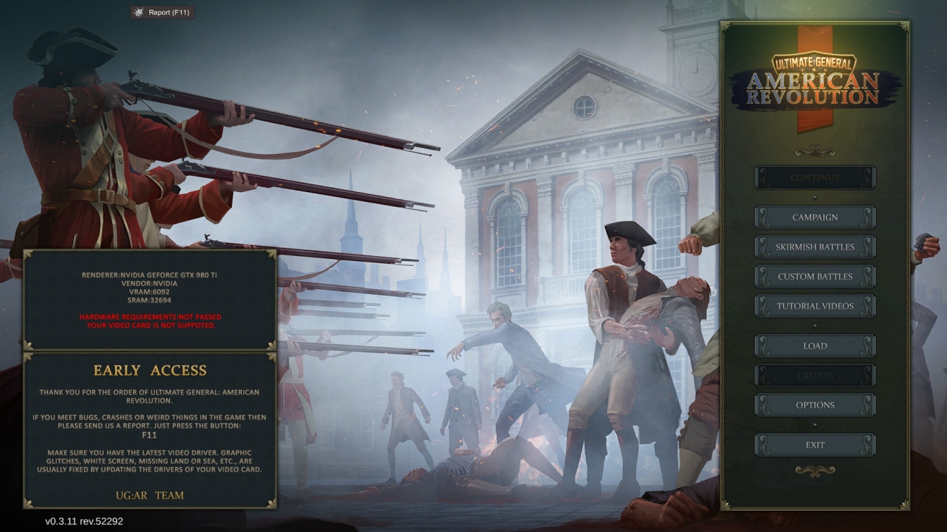
Ultimate General: American Revolution
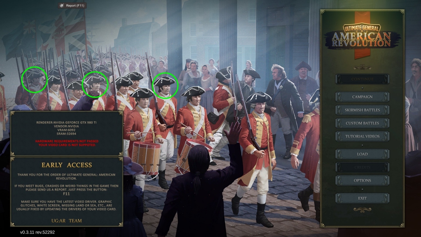
Early Access UG:AR uses its main menu to relay some relevant history and sneer at my video card. While I like the choice and composition of the three chosen scenes, the artist’s decision to include redcoated triplets in the above image does cost him a point.
Score: 7/10
Nuclear Option
![]()
The so-so screenshot… the line of dreary grey buttons… Nuclear Option has a lot of things going for it, but currently an eye-catching menu screen isn’t one of those things.
Score: 5/10
Songs of Steel: Hispania
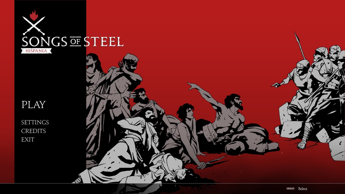
Stylish and understated, the subtly animated SoS:H start screen more-than-hints at Roman atrocities and echoes, perhaps unknowingly, the posters and programme of one of British theatre’s most controversial plays. Coming hot on the heels of an equally strong loading screen (an ivy-fringed mosaic floor turns red as the game loads) it sets the scene beautifully.
Score: 9/10
Second Front
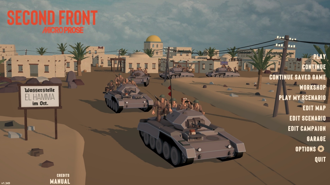
Because Jo Bader resists the urge to cram his menu screen diorama with death and drama, warriors and war machines, SF winds up with a very pleasing jumping-off point. The scene feels real because it is – minus a few tank riders – real.
Score: 8/10
Liftoff: Micro Drones
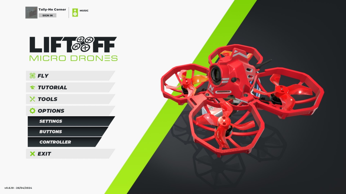
LuGuS lift a crisp but potentially soulless start screen with a dash of playfulness. Cursoring the quadcopter on the right (always the drone you last flew) causes its motors to spin up. The nearer to the centre of the drone you mouse, the higher the revs.
Score: 6/10
Whirlibird
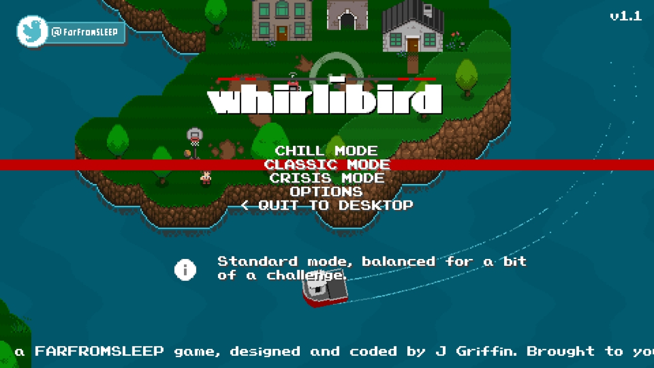
Whirlibird bolts its menu camera to either a roving chopper or boat, meaning you get a taste of the game’s Cyclone-inspired archipelagos while deciding whether to play in chill, classic, or crisis mode. It would have been lovely had the camera craft roamed at random rather than followed set paths, but grumbling about this ‘failing’ when developer J Griffin is charging a mere £2 for his work, feels horribly ungrateful.
Score: 7/10
Rolling Line
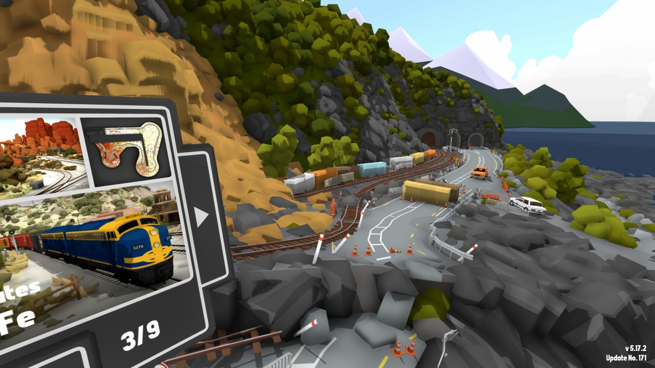
Bucolic valleys, alpine lakes, spectacular coastal highways, bubbling thermal springs, grimy sulphur mines… you never know where you’re going to find yourself when you launch deservedly popular railway modelling sim, Rolling Line. Although the menu UI always obscures a section of the 3D vista, because you’re free to rotate the camera 360 degrees, and there’s generally apt ambient audio lubing your lugholes, it can be very tempting to stand and (assuming you’re in a lineside spot) train-watch for a spell.
Score: 9/10
Strategic Command WW2: War in the Pacific
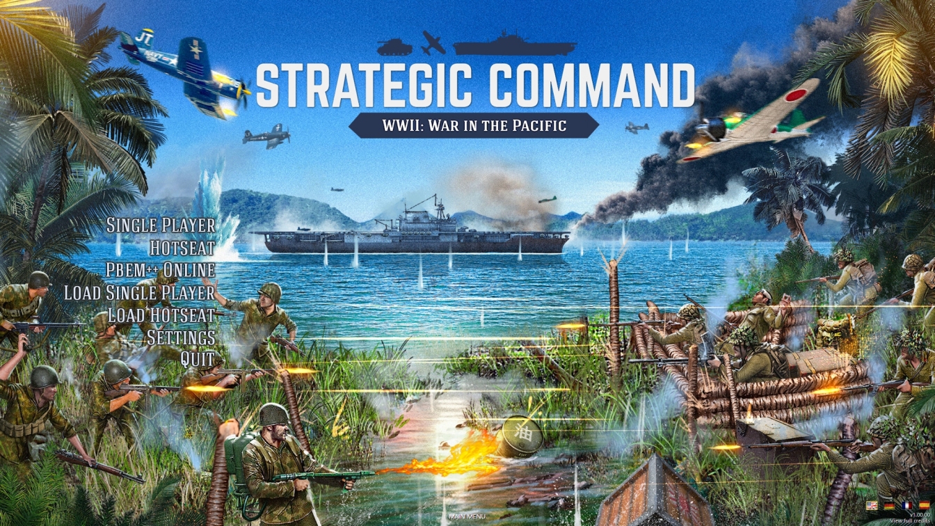
Once you’ve seen the bird table with the pitched roof at five o’clock in the above image, it’s impossible to unsee it. Why have Japanese soldiers wasted time constructing an avian eatery when, a few metres away, the PTO’s Most Conspicuous MG Nest was in dire need of camouflaging? Search me. You might just as well ask “Why has that daft flamethrower operator not opened fire yet?” or “Why has that USN carrier decided to get so close to a hostile shoreline?”. The latest Strat Com title has a main menu screen that has to be seen to be disbelieved.
Score: 3/10
The banner images that Slitherine made for the WW2 Combat Mission 2 games on Steam make me cringe every time. I wish could mod them out.
Right-click on the banner in Steam and you can set your own image.
The art slideshow that opens up Hearts of Iron IV I’ve always found particularly fetching. And many a time I’ve myself lingering on Civilization IV’s beautiful menu, unable to proceed for fear of being deprived of it.
Oh, the main menu song for civ iv is something I never tired of.
https://youtu.be/IJiHDmyhE1A?si=xE6vrd-yjoyRsec0
Excellent topic! A few THC friendly games I have installed..
Door Kickers 2 feels more warfare than police action but is aesthetically pleasing and the static image is carefully designed to allow the menu itself to be clear and easily understood. 7/10
https://steamcommunity.com/sharedfiles/filedetails/?id=3296114922
The Troop somehow fails on that yet at the same time obscures its background imagery too. There’s a tank there, and sometimes it fires its main gun, and sometimes explosions happen, but it’s all a bit abstract and unhelpful. Meanwhile the wall of text tells you what the buttons do – they’re not actually greyed out, they just look it. 2/10
https://steamcommunity.com/sharedfiles/filedetails/?id=3296113840
Fisher Online has a simple looping video of fish behind the menu screen, which itself is succinct. The game proper includes an in-game mobile phone offering options that might in some less inspired games be put onto the main menu. I’m fairly sure that video’s changed recently too, the fish less brightly coloured than the koi it had a month ago. It’s harmless and quite charming, but you tend to reach this screen and click ‘Play Game’ almost immediately. 8/10
https://steamcommunity.com/sharedfiles/filedetails/?id=3296113257
The animated animal on Way of the Hunter is placid and while waiting for you to make your choices just stands there chewing away and occasionally turning to look at you. It’s better than nothing but mostly it’s ignorable and adding no real value. The menu colour matches the font with the background, which is an interesting design choice. 4/10
https://steamcommunity.com/sharedfiles/filedetails/?id=3296111549
The menu in Uboat is clear, obvious and uses just a tiny sliver of the screen. Instead the bulk of the display is used for the inside of a Uboat pen, except in 21:9 it feels a little bare and bleak, the eponymous vessel shoved to one side as though it’s scenery and not the main character. Worse, all the water filling the centre of the screen ripples in the stiff breeze that’s, erm.. inside? 4/10
https://steamcommunity.com/sharedfiles/filedetails/?id=3296111002
(To confirm: All of those games remain installed because I want to continue playing all of them. Menu scores are not indicative of the game itself!)
Hmm. Scope for improvement across the board. I’m now wondering what might make for a good menu screen – I do like the ones that show AI playing the game behind the menu..
Tim, how could you leave out “Field Of Glory 2: Medieval” off your list? Immediately, to make it up to you, I command you for not including “Field Of Glory: Kingdoms” on your list – I am the only person in the whole world who finds the faux-medieval art of the game menus ugly and silly. Why Slitherine decided not to extend the “Medieval” art style to “Kingdoms” will remain a mystery and a blemish on the otherwise excellent game.
Any main screen that makes me think of King Ottokar’s Sceptre…
https://images.squarespace-cdn.com/content/v1/5ed508666d22ee22f0d60822/1622983479724-TK5P5DKWXDHDV4XJJCF0/king+ottokar%E2%80%99s+sceptre+facsimile-page-003.jpg
…scores highly for me.